Skip to content

Case study · IdentiFi™ brand and retail environment

From brand to build.

When SPE FCU was ready to move beyond its single-sponsor legacy, EmpowerFi led a complete renaming and rebrand. Design-build partner PWCampbell then carried the new Arize identity into a flagship branch in State College, Pennsylvania.
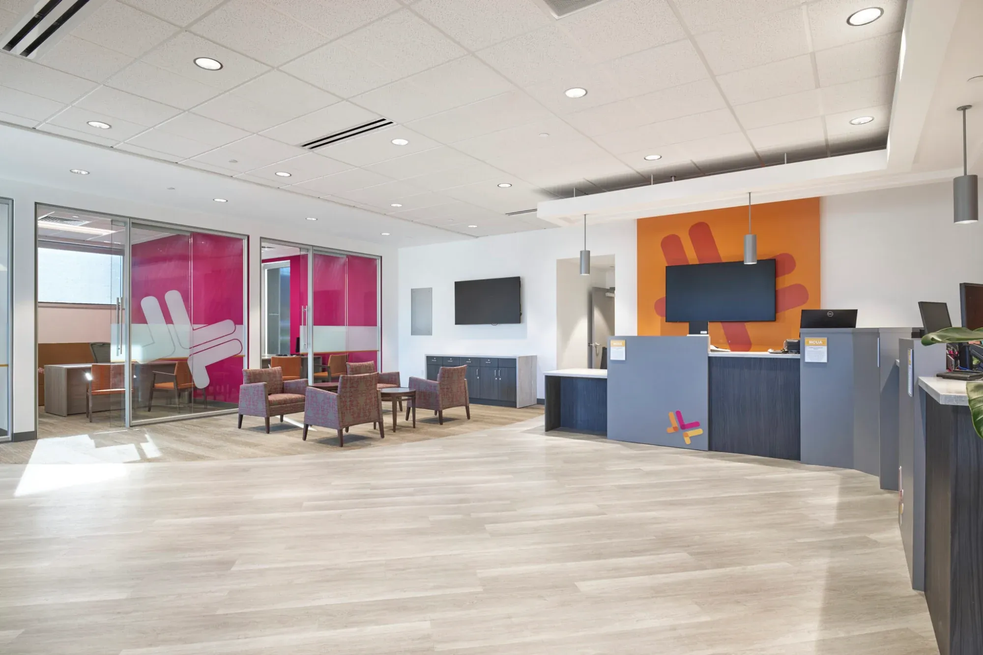
The Arize flagship branch lobby, with magenta and orange color-blocked walls, lounge seating, and teller pods
1 · StrategyRename and reposition
2 · BrandA complete identity system
3 · BuildFlagship branch
Client
Arize FCU (formerly SPE FCU)
Solution
IdentiFi™ rename, rebrand, retail
Partner
PWCampbell, design-build
Location
State College, Pennsylvania

Building the brand

A new name that signals momentum.

EmpowerFi led the full renaming and rebranding initiative, transforming SPE FCU into Arize FCU to signal momentum, visibility, and forward-thinking leadership. The work was grounded in the credit union's mission: to “inspire people to change the way they think about finances.”

Why orange and magenta

The shift from green to a bold orange-magenta spectrum was intentional. It signals energy, optimism, and modern relevance, and it stands apart in Central Pennsylvania's crowded financial market, where most competitors live in blues and greens.

  • A new value proposition and strategic brand positioning
  • The C.L.E.A.R. core values framework
  • A complete visual identity system: logo, typography, iconography, gradient treatments, and bold color architecture
  • Unique design elements that became signature brand motifs
  • A comprehensive brand guide for long-term consistency
Pages from the Arize brand guide: a grid of member portraits, the orange and magenta arrow motif, and sample layouts

Designing the experience

Sleek, modern, and unmistakably Arize.

With the brand firmly established, PWCampbell brought it to life in a ground-up flagship prototype branch: color-blocked walls, glass treatments featuring the brand mark, interactive iPads, and digital signage that communicates the branch's energy savings.
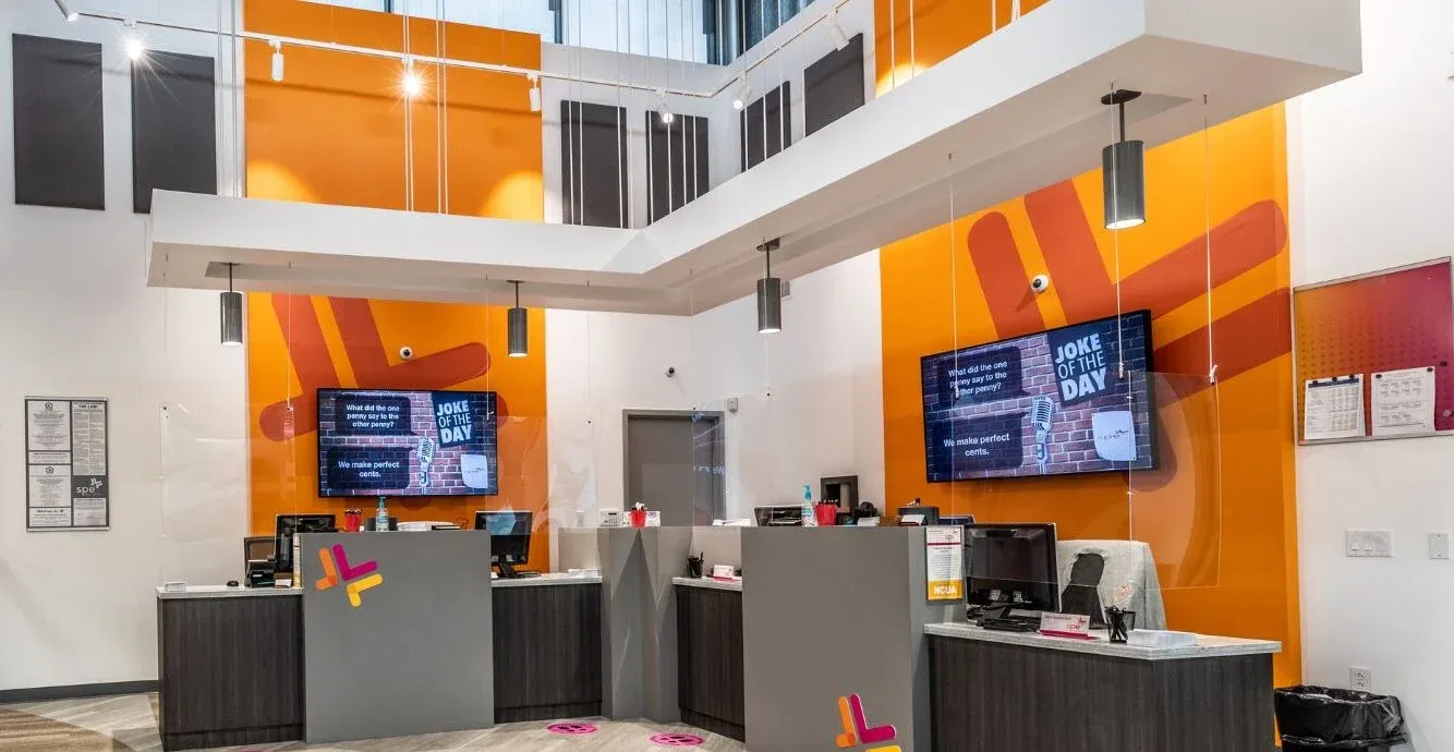
The teller line under a two-story atrium, with orange walls, digital screens, and the Arize arrow motif
Teller line
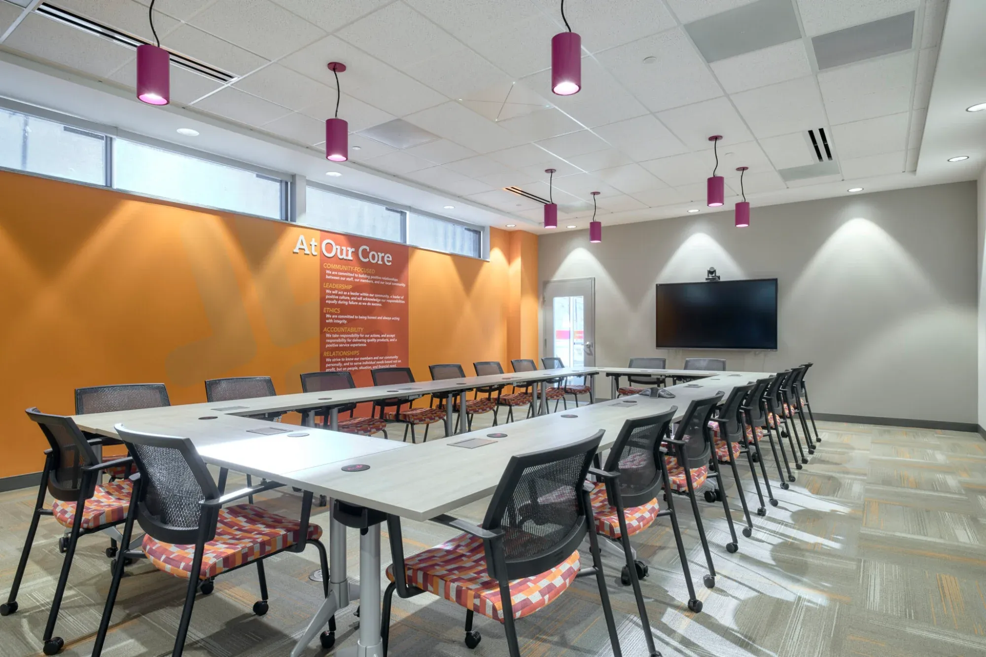
A community room with a long conference table, an orange accent wall, and magenta pendant lights
Community room
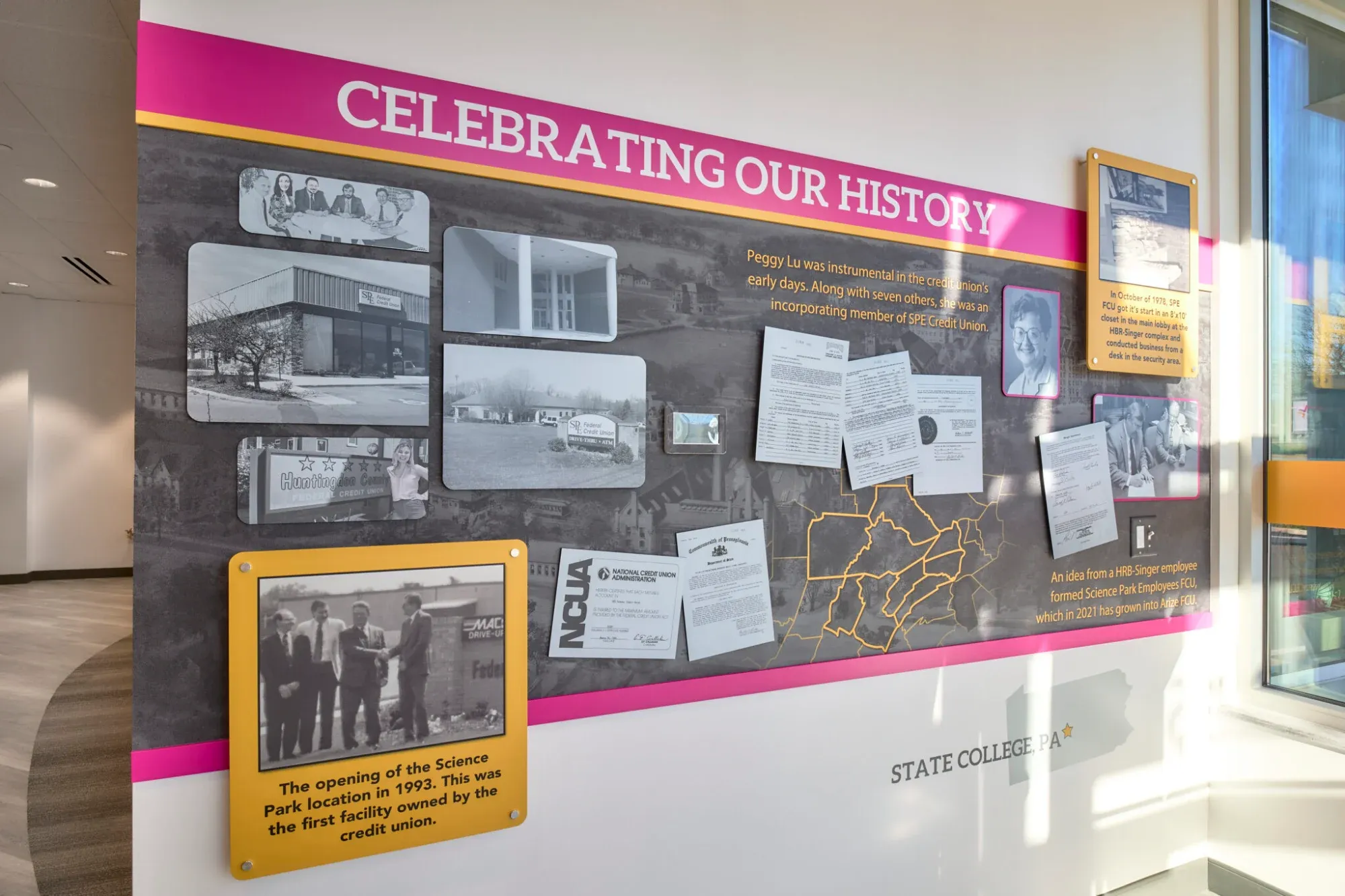
A history wall titled Celebrating Our History, with framed photos on a dark wall trimmed in magenta and yellow
History wall
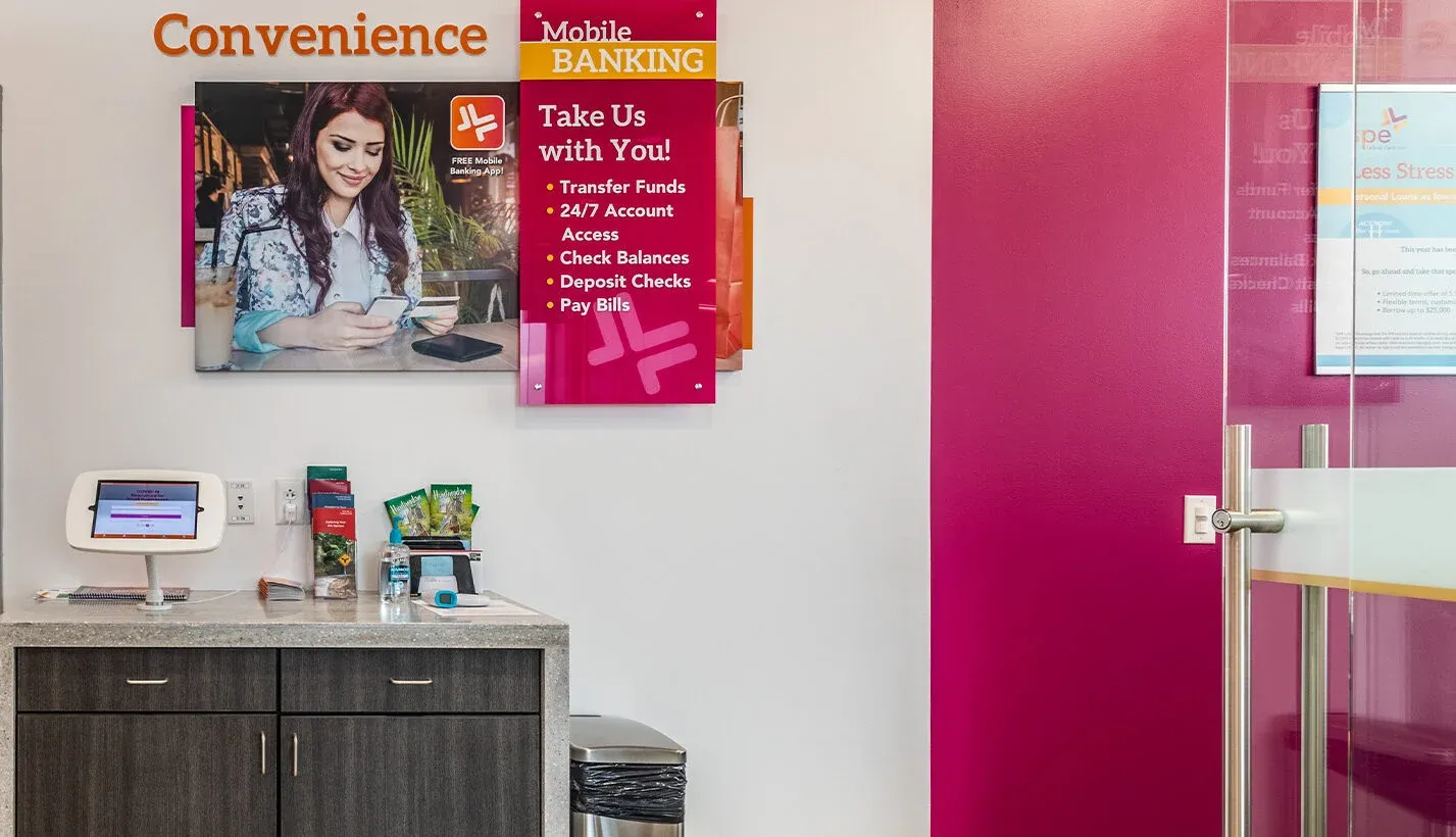
A convenience area with a branded wall graphic, a self-service kiosk, and a magenta glass door
Convenience area

Together we're better

EmpowerFi defined the identity. PWCampbell built it.

Because the brand system was built ready for physical space, with color theory, graphic elements, and clear positioning, PWCampbell had a strong foundation to translate into architecture, materials, lighting, and technology.

EmpowerFi

Brand strategy and identity

  • Full renaming, from SPE FCU to Arize FCU
  • Value proposition and positioning
  • Core values framework
  • Visual identity system and color architecture
  • Brand guide built for physical environments
PWCampbell

Branch design and build

  • Demographic analysis and strategic site selection
  • Branch optimization and architectural design
  • Interior design and branded environments
  • Construction and pre-construction management
  • Integrated technology and digital signage
  • Sustainability, including a solar field

The outcome

Brand and build, one seamless strategy.

The result is a retail branch designed for growth, and a cohesive experience where members meet the same brand from marketing to branch.


  • Brand values are visible in the space
  • Messaging aligns with physical design
  • Technology reinforces forward momentum
  • Sustainability supports brand credibility
  • Members experience consistency from marketing to branch

Make your brand a place members can walk into.

From a new name to the branch floor, we help credit unions build brands that hold together at every touchpoint.